Menu


BRAND IDENTITY
LANDING

ABOUT THE PROJECT
Tigan company provides services for businesses in the field of automation and IT: supplies equipment and the implementation of solutions.
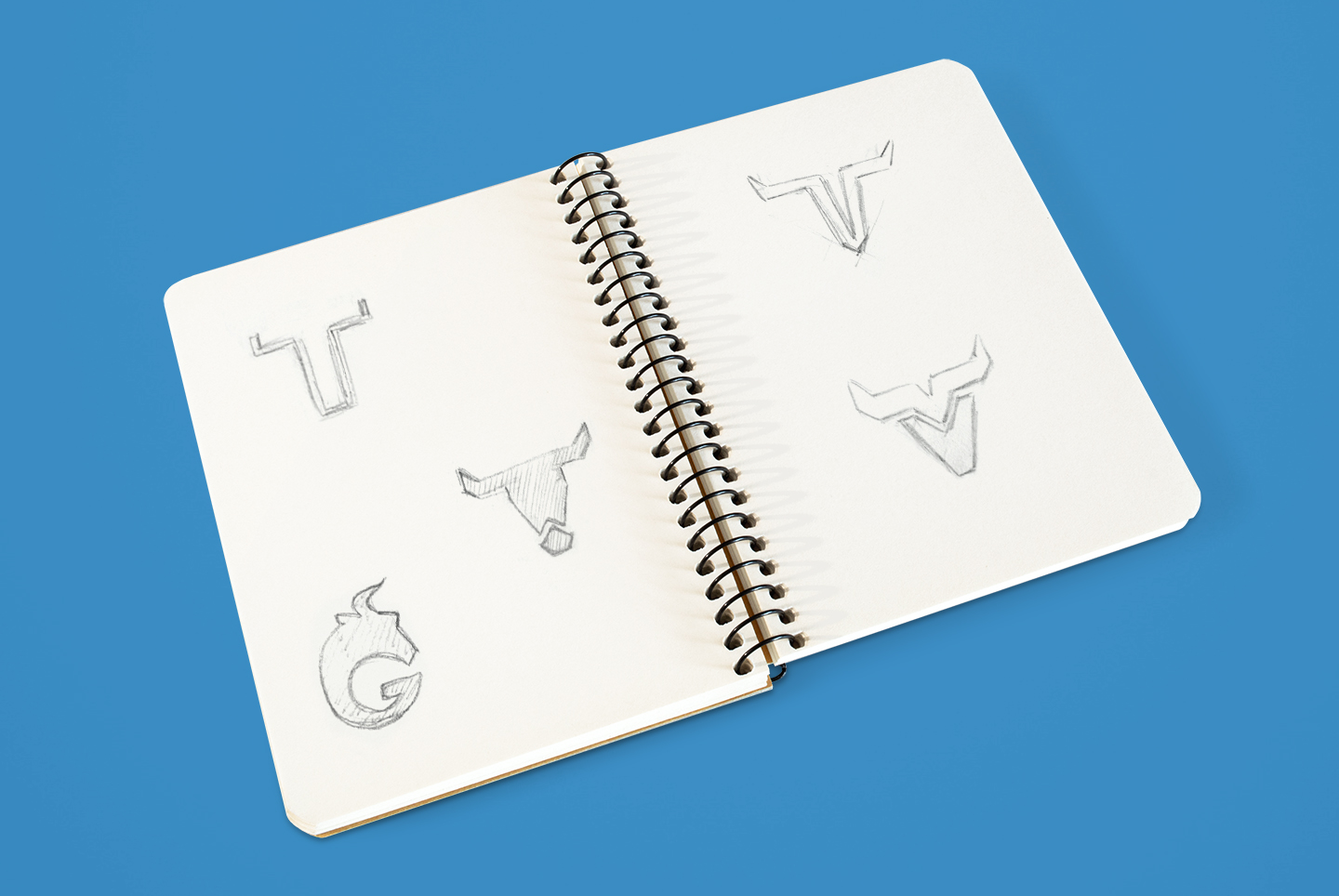
We had several tasks: to create a logo, brand identity and landing. According to the client’s wishes, the image of a bull as a symbol of masculinity, strength and confidence was taken as the basis.
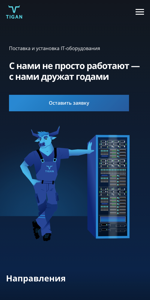
The overall style of the project is masculine, technological, modern, and friendly. It was important for the client to keep a friendly attitude to the website, so we suggested using illustrations.
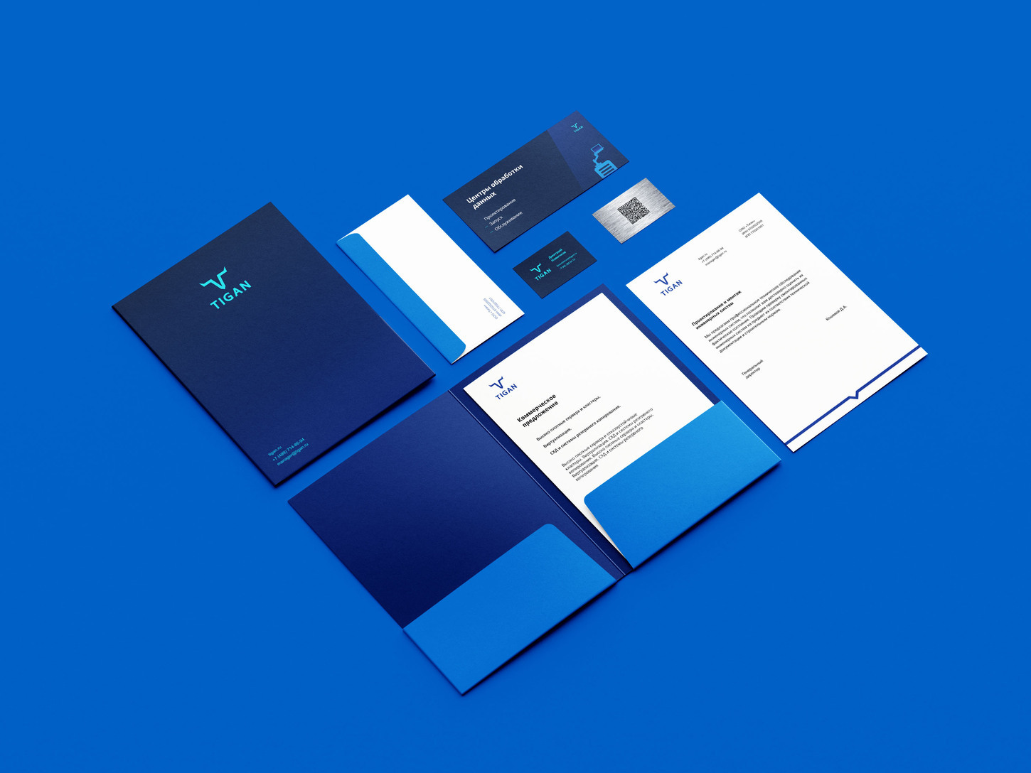
The selected palette in blue tones is associated with business, modern technologies, and a serious approach to work.
We had several tasks: to create a logo, brand identity and landing. According to the client’s wishes, the image of a bull as a symbol of masculinity, strength and confidence was taken as the basis.
The overall style of the project is masculine, technological, modern, and friendly. It was important for the client to keep a friendly attitude to the website, so we suggested using illustrations.
The selected palette in blue tones is associated with business, modern technologies, and a serious approach to work.


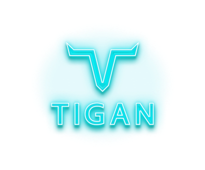
LOGO


COLOR PALETTE

GRADIENTS


TYPOGRAPHICS


ILLUSTRATIONS
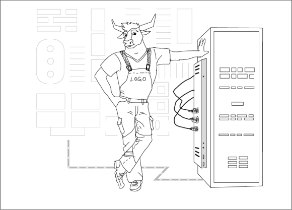
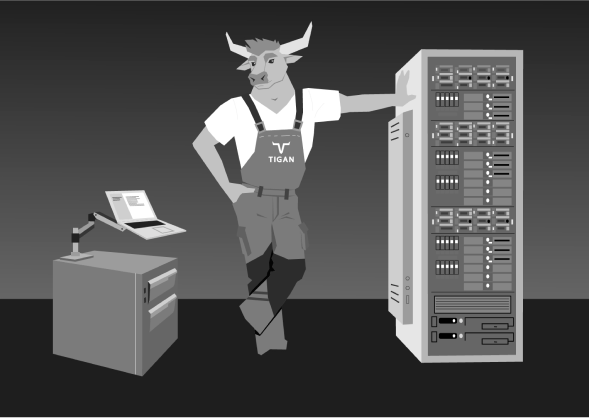


The character and illustration continue the bull theme and repeat the stylistics of the logo: the lines and shapes are confident, slab, and clear. Diagonally slanted strokes add dynamics and brutality.
Our objective was to create a bull with a human body. Confident, strong, not cartoonish and not aggressive. The color palette had to look good against the dark background of the website.
Illustrator divided the work into three stages: sketches, prototype, colored illustrations. Each stage was coordinated with the client.
ICONS


LANDING
ADAPTIVE
1440 px
1440 px

ADAPTIVE
375 PX
375 PX
THANKS
FOR WATCHING!
FOR WATCHING!


Leave a request
By clicking the button you agree to the Privacy Policy
OTHER PROJECTS

© Les Agency

